Designing flyers taught me how much color, typography, and imagery can shape the mood of a project.
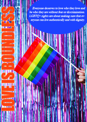
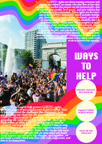
The first flyer I created was for a Pride festival. I used bold, vibrant colors and playful typography to capture the joy of the event, while ensuring the layout was clear and easy to follow. The flyer highlighted music, performances, and community celebration in a visually inclusive way.
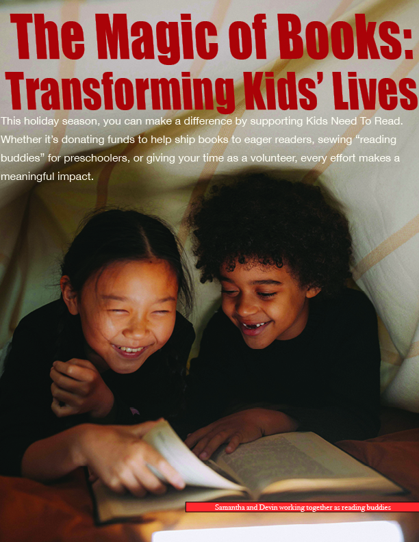
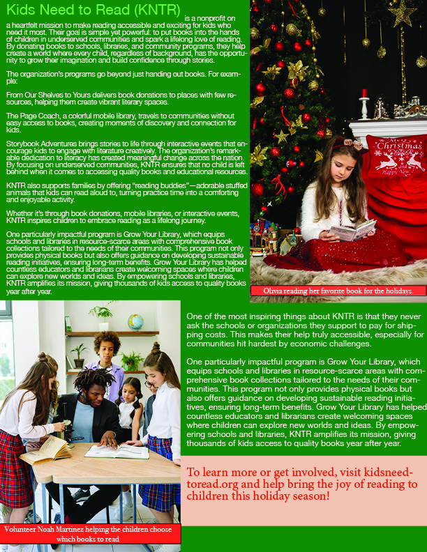
The second flyer was a holiday campaign about supporting kids and their need to read. For this one, I used warmer, festive tones and imagery that evoked the spirit of giving. Typography choices leaned toward a friendly, approachable style, making the message welcoming to families.
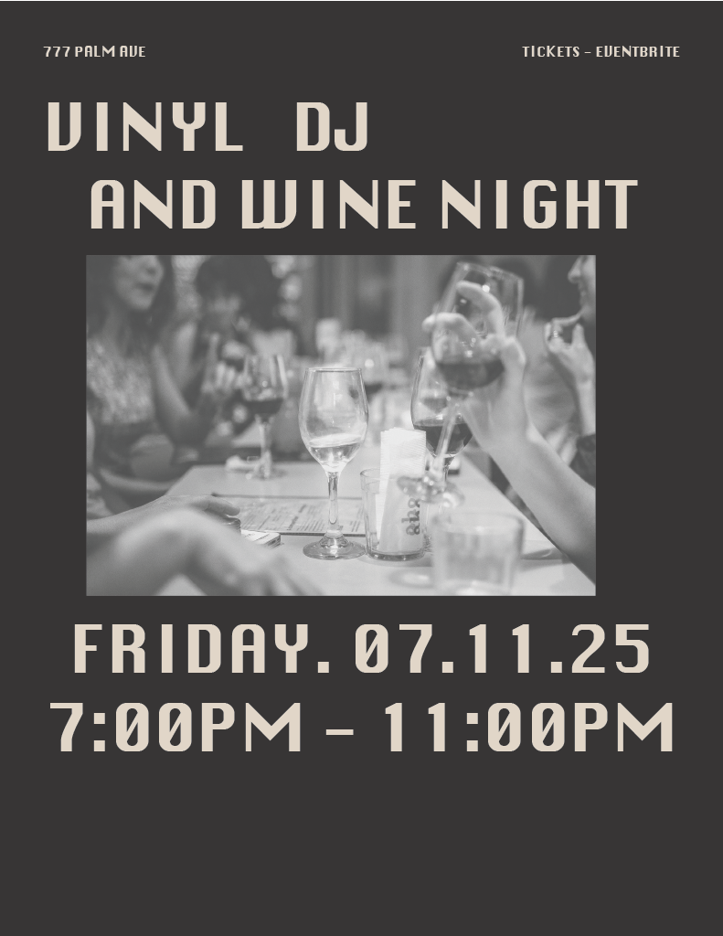
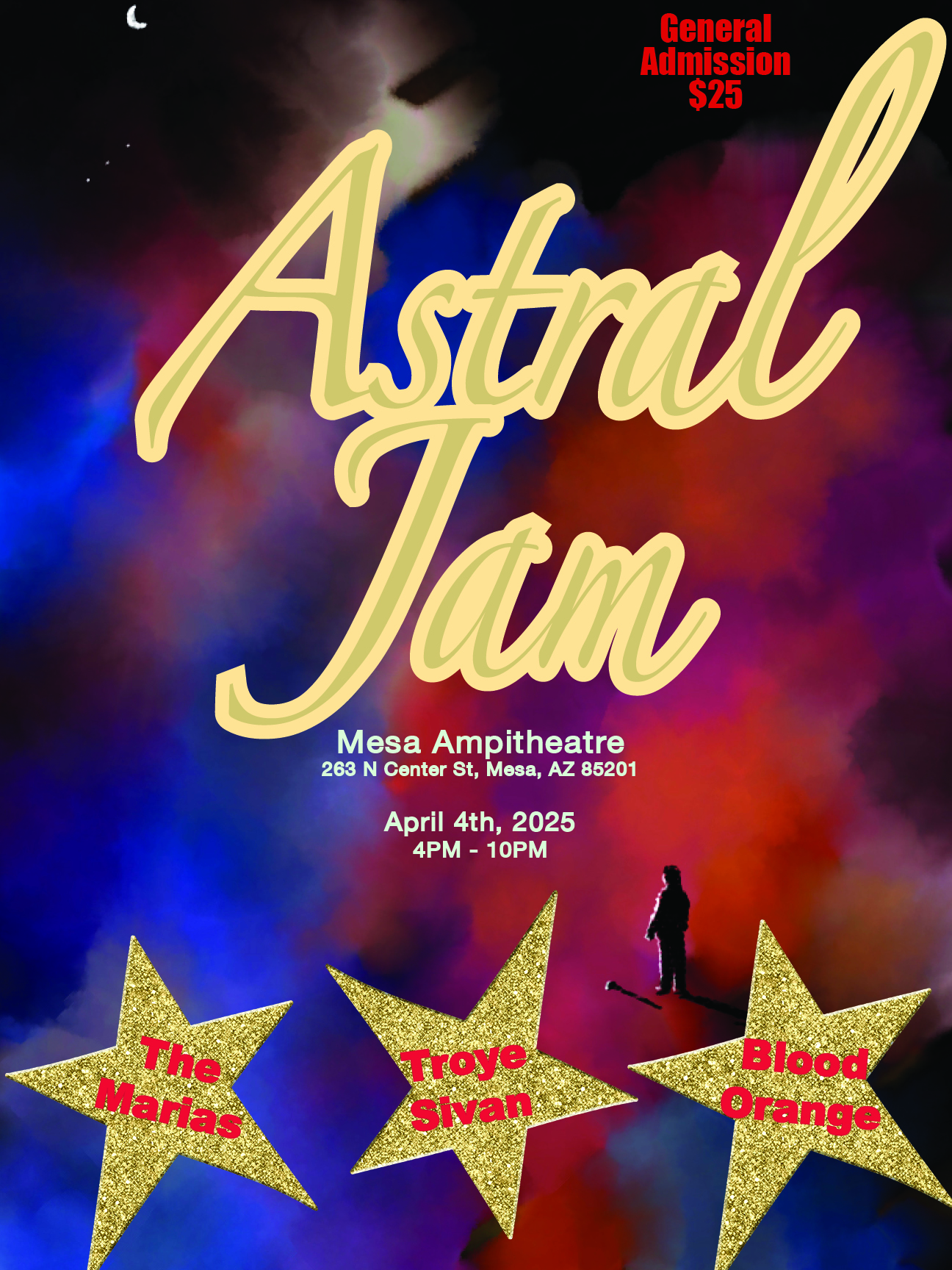
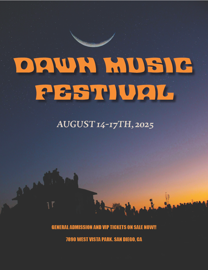
In both projects, I worked with stock images and experimented with layout to balance visuals and information. These flyers represent my ability to design for different moods and audiences while maintaining clarity.
